
This picks up where collection ends. The survey has closed, the responses are in, and the question is what to put in front of the people who will act on it. Getting the data was the expensive part; presenting it badly is how organizations waste it.
A good compensation survey report (a salary survey report, if salaries were all you collected) does one job: it turns a pile of responses into a small number of defensible decisions. This guide gives you the structure to use, an outline you can copy, and how to interpret the results without fooling yourself, using the Sensible Surveys results views as a worked example.
A compensation survey report template
Below is the skeleton. It is deliberately plain: seven sections, in the order readers actually read them. That order is doing real work, because readers stop early. Copy it as your starting structure, then use the rest of this guide to fill and interpret each part.
Compensation survey report outline
- Cover and cohort. Respondent count (N), industries, geography, effective date, and the suppression threshold. All of it before any number.
- Executive summary (one page). Where the organization sits overall, the roles furthest from market in either direction, and what changed since last cycle. Most readers read only this.
- Results by job. For each occupation and level: N, the 10th / 25th / 50th / 75th / 90th percentiles, the mean, and the year-over-year change.
- Your position. For each job, the percentile your organization actually pays at.
- Year-over-year movement. How far the market moved per job family, set against your own increases.
- Recommendations. Specific and costed: which jobs to adjust, to what, and the total.
- Methodology and appendix. The instrument, how jobs were matched, the suppression rule, and every source with its date.
That is the whole template. Everything below is how to fill it in and, harder, how to read it.
How to fill the sections that get done wrong
Put the cohort before any number. A benchmark without its cohort described is not evidence, and anyone asked to defend a pay decision is asked this first: who else is in this data, how many of them, and how current is it.
Keep the response count beside the figures. N belongs in the results table next to the percentiles, not buried in a methodology appendix. A reader deciding on a number needs to see how many employers stand behind it in the same glance.
Give participants what they need to translate the report into decisions. A table of market numbers with no framing is homework you have handed back. Show each participant where they sit against the cohort for every reported role, so the follow-up in-house is “we pay at the 38th percentile for maintenance technicians” rather than a scan for the closest column.
Point to what movement in the market would cost. A report that stops at observation gets filed; one that lets a participant plug in a small number of role counts and see what closing the gap to median would total gets a follow-up meeting.
How to interpret the results, view by view
The advice above is easier to follow against a real results screen. Here is how each part reads in Sensible Surveys; the same logic applies whatever tool compiled your report.
Results by job, in one view
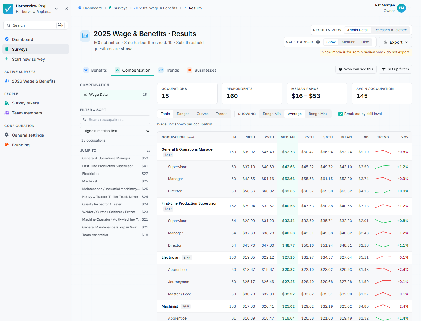
Each occupation, and each skill level under it, gets a response count, the five percentiles, the mean, a standard deviation, a trend sparkline, and year-over-year change on one row. Three habits keep you honest:
- Read N first. A 90th percentile computed from four employers is noise wearing a statistic’s clothes. The column is first for a reason.
- Prefer the median to the mean when they diverge. Divergence means an outlier is pulling the average; the median (highlighted in the table) is the sturdier number.
- Watch the 25th-to-75th spread. A tight band is a well-defined market rate. A wide band on a small sample usually means the title covers materially different work at different employers, which is a job-matching problem, not a pay finding.
A percentile is a position in a ranked list, not a grade. The 50th is the middle of the market, not the “correct” number; the right target differs by job family depending on how hard the role is to fill and how costly its turnover is.
Filter to your actual peer set
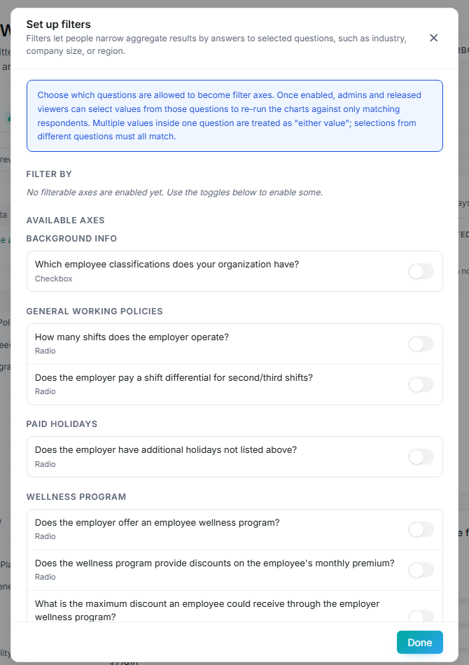
A market number only means something against the right cohort. Filter axes let you re-run every chart against just your industry, company size, or region, so “the market” is the one you actually compete in, not a national blur. And if most of your responses come from a single sector, say so on the page: every cross-industry figure is really describing that sector.
Year over year: where the market is heading
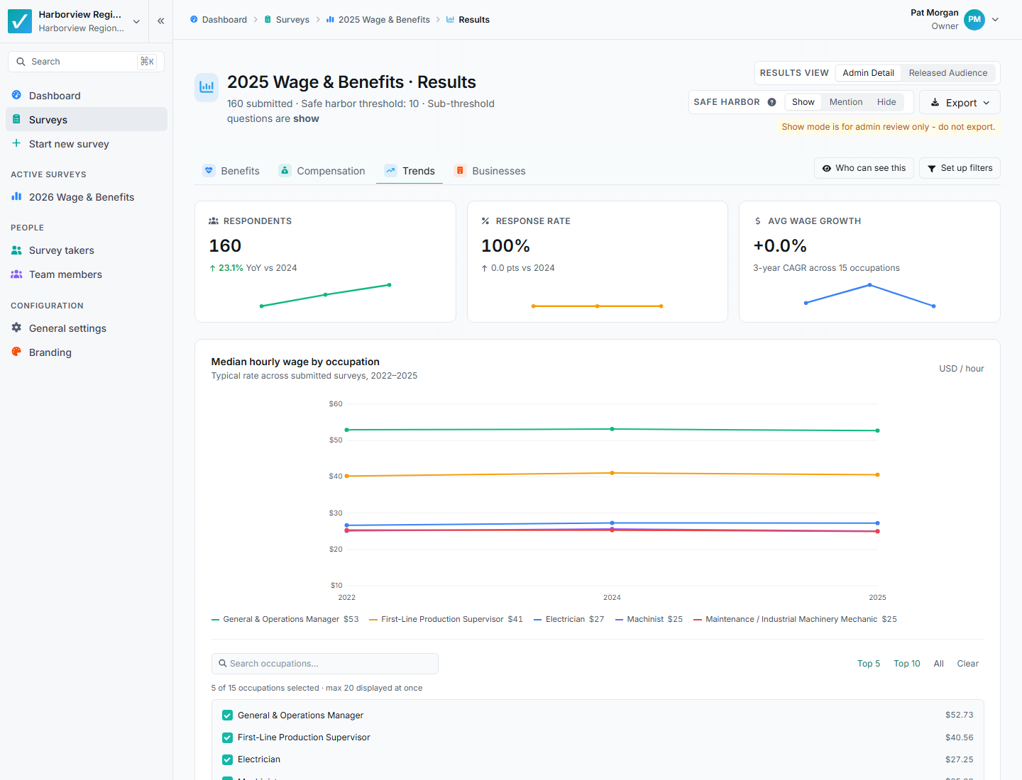
One cycle tells you where you stand; two tell you where the market is going, which is what you actually need, because every pay decision takes effect in the future. This is usually the most decision-relevant page in the report: a 2% raise against a market that moved 4% is a real loss of position, and it only shows up here.
What a suppressed cell looks like
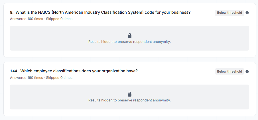
Below the safe-harbor threshold, a figure is hidden so no single employer’s pay can be reverse-engineered from the aggregate. Two things follow for the reader: a hidden cell is protected data, not missing data; and a number that survived suppression by one or two responses should be read as directional, not precise.
Results that should not drive a decision
- Thin cells. Anything at or near the suppression threshold. If a figure survived by one response, treat it as directional at best.
- Unexplained outliers. A rate several times the market is usually a mismatched job or a units error, hourly entered as annual. Investigate before you either act on it or delete it, because the explanation is often useful.
- Skewed industry mix. If most responses come from one sector, every cross-industry figure describes that sector. Say so on the page rather than in a footnote.
- Jobs matched on title alone. A wide band with a small sample frequently means participants reported different work under one label. That is a design finding, not a market finding.
- Figures without an effective date. Especially when combining sources. Data ages from collection, and undated numbers get quoted as current long after they are not.
Presenting the report: two audiences
A compensation survey report gets presented twice. First by the survey administrator, back to the sponsoring body (the association board, the EDA council, the consulting client’s steering committee), who ask the predictable set: how many employers responded, how is the cohort composed, is the data current, is the methodology defensible, what changed since last cycle, and how does this compare to what other regions or sectors are seeing. A short front-of-report summary that answers those in order carries most of the meeting.
Second, by each participating employer, back to their own stakeholders. Give them what they need to do that well: a per-role position line against the cohort, a plain description of the peer set they were compared to, and a note on which figures were built from thin samples so they know which claims will hold up when their own leadership pushes on them. A one-page participant summary saves everyone the exercise of building it from the full report.
Where the methodology itself will be scrutinized, having an independent Ph.D. methodology review behind the instrument is worth more than any additional analysis, in either room.
Building toward next year
A single cycle tells you where you stand. Two cycles tell you where the market is going, which is what you actually need, because every pay decision takes effect in the future.
Protecting comparability is mostly about restraint: keep question wording stable, keep the job list stable enough to trend even as you add roles, hold the peer definition steady, and archive the instrument alongside the results. On our platform the cycles link directly, so returning respondents see last year’s answers pre-filled and the trend series builds itself. However you run it, the discipline is the same.